Project Details
Client:
Birchwood Lane
Creative Fields:
Print, Typesetting, Custom Illustration
Summary:
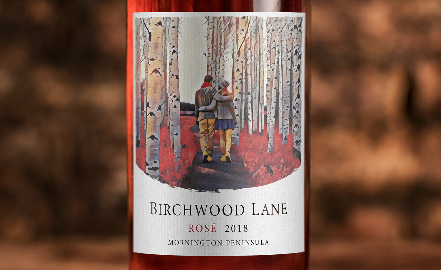
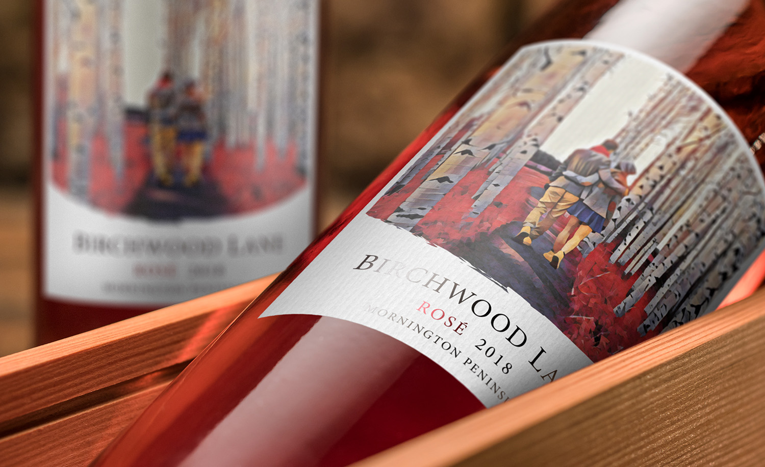
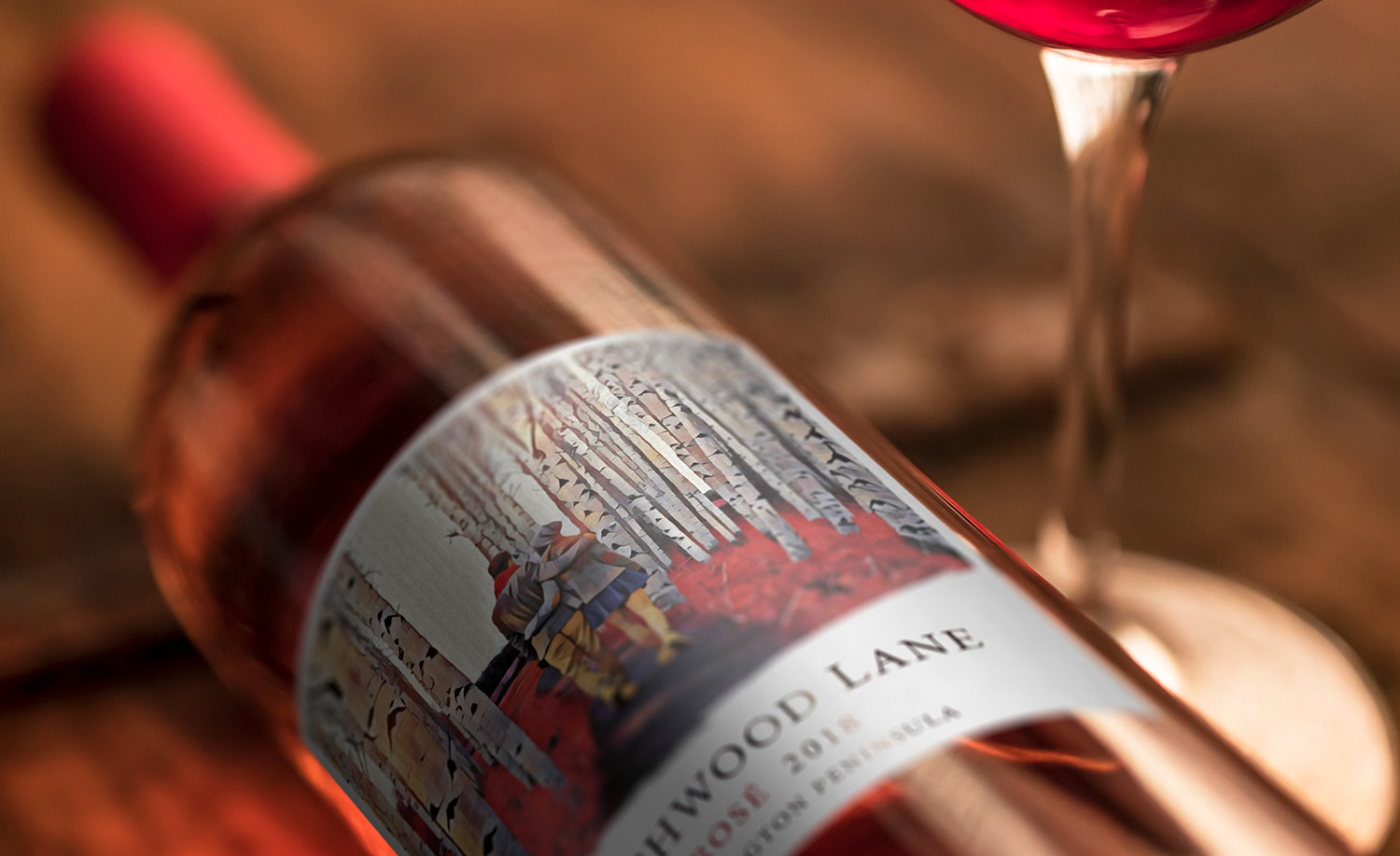
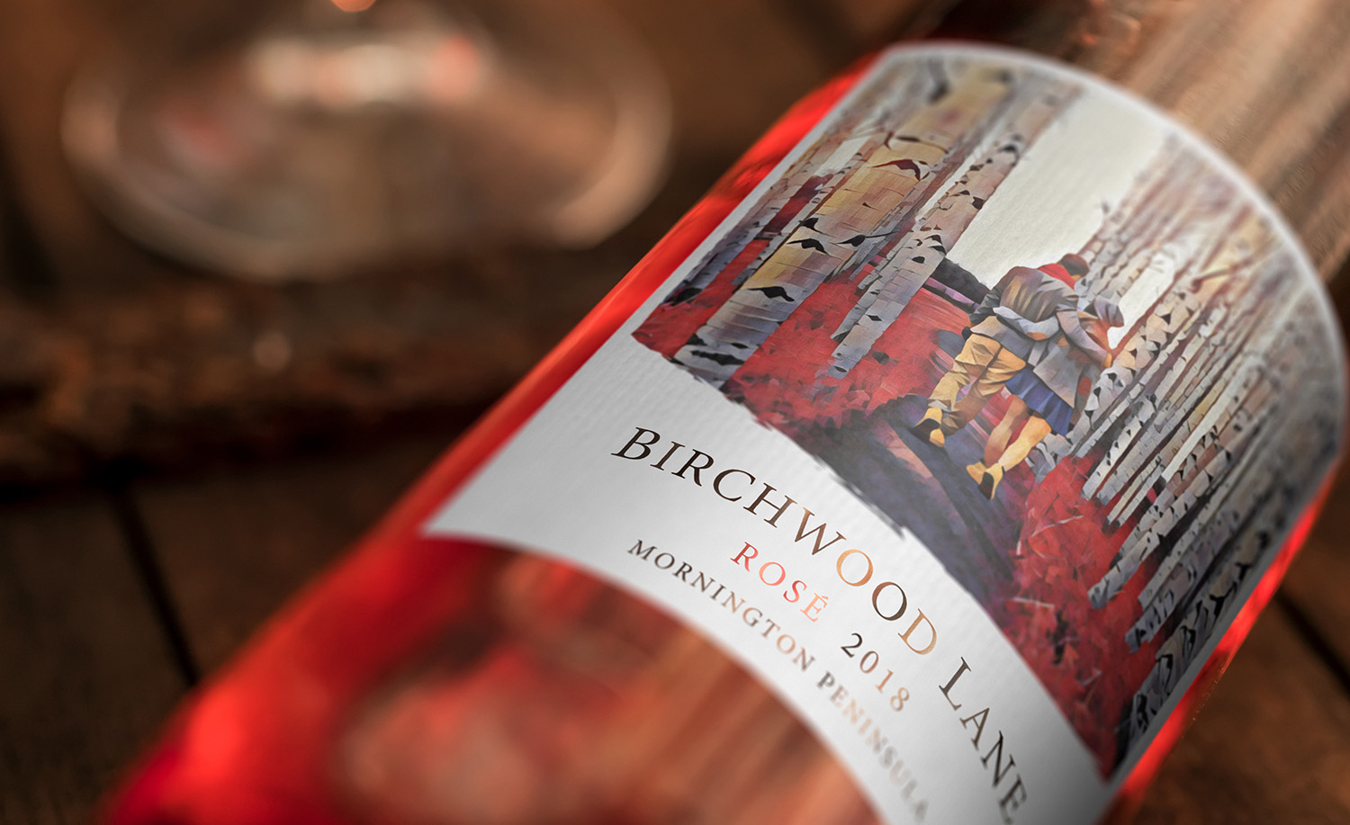
“We live in a visual age. And wine, a product that appeals principally to the senses of taste and smell, must rely on its one purely visual component—the label—to attract consumers.”
Approaching this overall design with this mindset, we set out on creating an interesting but visually intriguing design. The client requested that we make the label art feel like a story that has somewhat of a history behind it. We chose a more photorealistic approach at the beginning, this felt a little flat and lacked a sense of history and class. We adopted a more artistic and playful design after many variations of the label.