Project Details
Client:
Pagedcare
Client Website:
Creative Fields:
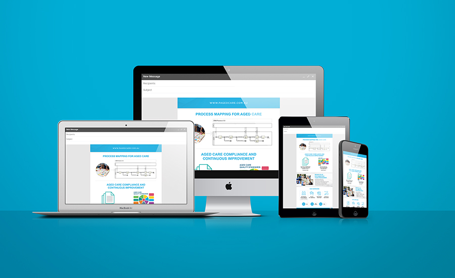
Branding, Print, Typography, Logo Design
Summary:
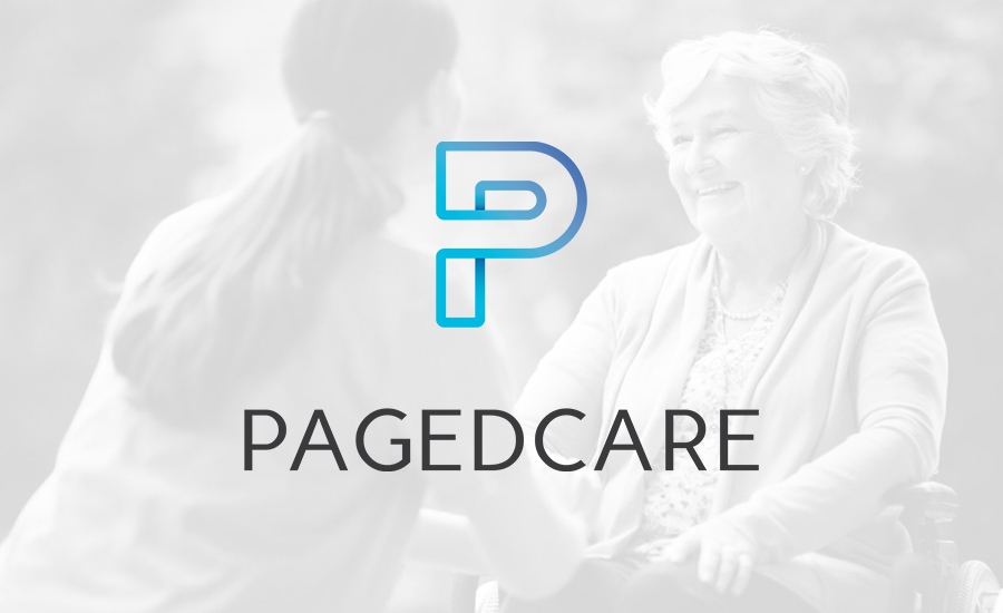
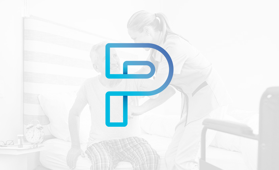
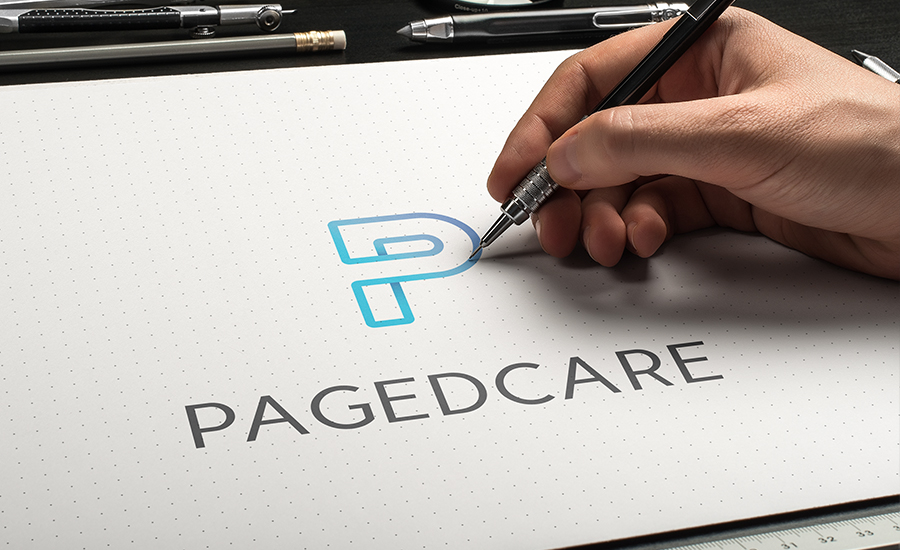
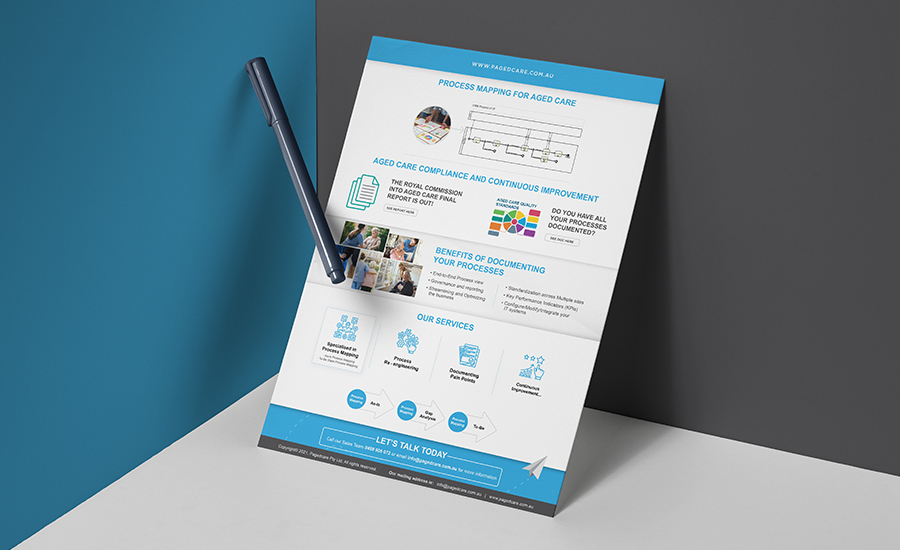
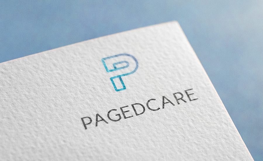
Ken from Pagedcare approached us in need of some simple and effective branding that could set him apart from his competitors. Our approach on this branding was to create something that stylistically looked nice but also had a concept and meaning behind it. He wanted to convey a metaphorical path concept that helps support the idea that Pagedcare can put you on the right path and help you.
The colours that we chose were nice and neutral colours that made the logo feel inviting and comforting, this is important when dealing with aged care. We wanted to blend the look of a corporate style and a modern inviting feel. This was done by creating a simplistic logo that will age well and also choosing a complementary font that is still nice and modern but still retains that series business look and feel.